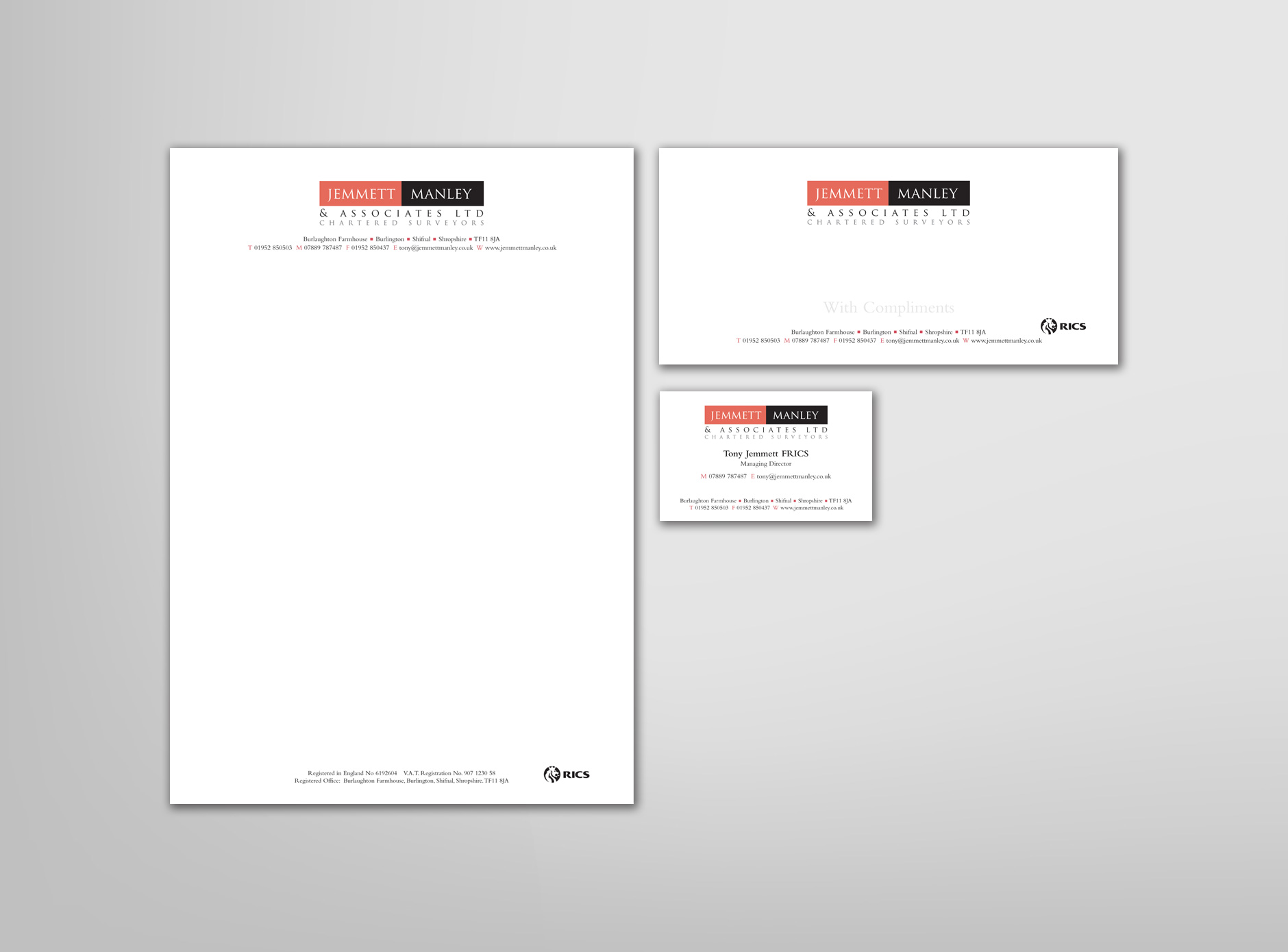


Corporate identity for a chartered surveyor, formally working for one of the top companies in Birmingham. I was approached with a simple brief of being very classy but at the same time wanting an old school style of branding.
The desire for the client to use terra cotta colours in the artwork became the starting point for an ancient Rome touch to the design.
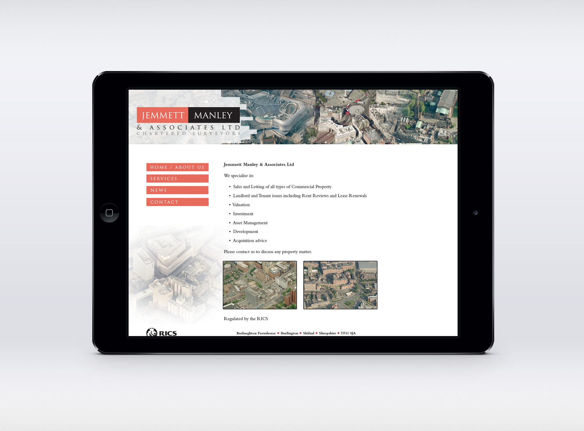
Website concept for a chartered surveyor including online banners for internet and email promotion. The design combines aerial photographs of major cities in England, demonstrating the fact that the company operates in key areas and are confident in their experience and approach.
