Blog
An Old Logo from the Design Portfolio

I’ve decided to post an old logo I designed at South Staffordshire Council a while ago when one of the key issues of the moment (and still is) was global warming and looking after the environment. Friends & colleagues have been asking about it on several occasions when viewing my print-based portfolio, many saying “that looks nice” and “where did this come from?”.
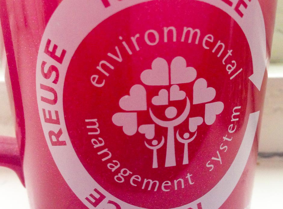
Well, the environmental management system (EMS) was an internal communications group to promote environmental awareness within the district of South Staffordshire. Team leaders requested a branding for this organisation which would distinguish that the council was an active associate in this philosophy.
My simple idea was based on a family looking after and loving their surroundings. The design evolved from numerous concepts and eventually resulted in the finished logo display here, with a tree represented by figures and hearts symbolising it’s foliage. Inspiration was taken from a classic graphic design piece, which at the time of writing this, fail to recall me.
The design was then applied to a range of promotional material at the council including posters, an online campaign and mugs. Looking back, the branding was actually the strongest part of the initiative, from which I received lots of positive feedback.
