3 Types of Images for Website Success

When we start designing a website a creative undertakes visual storytelling and associates different types of images to a page to achieve the desired results for the customer. These usually consist of three different types of imagery: iconic images, symbolic images, and indexical images. Although all three are dramatically different in concept, there’s not just one type that’s best suited to web design – each one has their own visual merit when representing information. So what are the characteristics of these different types and how should they be used?
1 – Iconic images
![]()
An iconic sign is one that bears a resemblance to that it which it represents.
Iconic images are visually associated with a design concept and are instantly recognisable. This means that even if someone isn’t familiar with the background idea, they will certainly deduce what the general meaning will be. Objects such as arrows, map pins and shopping baskets are all all simplified forms of physical things. As such they can be interpreted with or without the use of text labels to identify them. Charts and diagrams are examples of iconic images in action – they represent and display information in such a way that’s hard to misinterpret.
When we visit websites or use an app we can quickly understand the meaning behind its icons. A house can indicate the homepage, an envelope can indicate an email CTA, a magnifying glass can indicate a search facility, etc. As web design best practice, it’s not always a case of re-invented the wheel. Icon imagery has become so culturally mainstream that widely used graphics can be used to create an initial understanding of the platform. The creative touch can therefore be added after the baseline has been established.
One design rule to remember though is that not all icons can be iconic, a further explanation may be required before they can be correctly interpreted. This is the case when designers customise the sites design or theme for their own purposes and as such the iconic language changes to suit purpose. At the very least there should be the option of displaying a text label when a user hovers over the accompanying graphic.
2 – Symbolic images

Language is an example of a symbolic sign as a word’s relationship to that which it represents is random. Symbolic signs are recognised because they are ‘ socially agreed’.
Symbolic images are generally more abstract than iconic images, often conveying a feeling or emotion rather than a specific object. They are often utilised in logo designs, reinforcing the ideas the brand wants to convey. The images are not instantly recognisable like icons because they don’t need to be communicated literally. A Symbolic image uses a visual grammar called semiotics that are metaphors for the specific thing or idea.
The downside is that unlike iconic images their meanings need to be taught rather than visually deduced. They are often based on cultural associations rather than a universal understanding, which means that geographically one visual representation may mean something completely from country to country. This can be a challenge on the web where your site may be relevant across the globe. In a study by the Catalyst Group it revealed that interpretation of the hamburger icon widely used in web design is actually age-sensitive. The results showed that 80 per cent of younger users aged between 18-44 understood its meaning, while 52 per cent of older users aged 45+ understood.
3 – Indexical images

An indexical sign has a direct relationship or causal link to that which it represents.
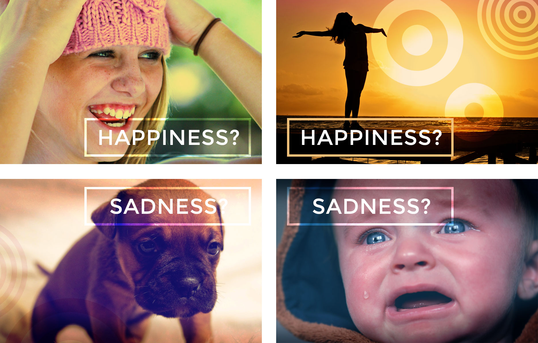
Indexical images don’t resemble there signified object but are directly connected in some way to the idea. They are the link between the appearance of the image and its representation and are some of the most commonly found images in the design and advertising world. As a creative we tend not to represent ideas too literally generally because we prefer to evoke an emotion or thought process from the subject matter rather than spoon feed the information to the user.
When creating a website we want the user to get a flavour of the subject, so selecting images that evoke the feeling without shouting about it is the best place to start. Choosing the correct colour palette as well as the relevant typeface are all key components in the emotional recipe for success. For example, using a colour scheme based on bright neon combined with funky electric fonts may represent the 1980s, but used on a 1940s website would look totally out of place and create a different impression of the site.
Time to choose
So what works best? Well all three image modes have their place in design best practice. Just like all creative techniques it all depends on the criteria for your project. Remember to put down some ground rules first though, visitors like familiarity around a site and don’t want to second guess what a button or image may do. Make your navigation instantly recognisable and clear for your target audience. Don’t make it difficult for them to move around your site or they may just leave out of frustration. Do your research and see what does and doesn’t work by searching on your concept keywords. This is essential when determining what types of images should be avoided in your visual storytelling. On a personal basis you may not associate an image with a particular idea, but you may find out that a significant proportion of the population may make a clear connection with the visual.
